Enhanced and Efficient Design with Rapid Prototyping

The career of a designer is often both demanding and challenging. Design is incredibly subjective and each person has their own opinions and interpretations. To ensure your vision is realized you can implement interface prototyping to visually display thousands of words worth of design and development requirements regarding how a system should both look and behave. To take this one step further, RAPID prototyping involves quickly mocking up the future design state of your app or website and validating with a broader team of users (developers, product owners, designers). The term prototype covers a wide range of presentations from rough sketches on notebook paper to full-fledged interactive examples that can often feel like the end product. Getting feedback early can set the stage for the entire project. Responding to feedback in a timely manner and implementing the right approach will allow the rapid prototyping process to accelerate additional productive discussions while ensuring the team is on the same page so they can ultimately deliver an outstanding product.
DO’S AND DON’TS
DO…
- Set expectations for the scope of the project early on. Inform others that the Rapid Prototyping process is a tool to showcase the design and is by no means the final product.
- Set yourself up for success by creating reusable elements. Whether it be Photoshop templates, stencils, code widgets, etc.
- Be open minded and receptive to peers and their feedback. They benefit from your teachings and education.
DON’T…
- Receive every single comment, change or request to heart and cement it as a needed requirement. Everyone will have an opinion and sifting through the feedback to implement only the critical or productive feedback is an important part of your job.
- Do not over commit. Make sure you mockup and prototype features that you know are conceivable that can be implemented on-time and within budget.
- Perfection is not possible. Rapid Prototyping is just that, quick! Which means polishing your design for hours and hours will defeat the purpose. It is meant as a strong guideline and not a pristine creation.

THE ACTUAL PROCESS
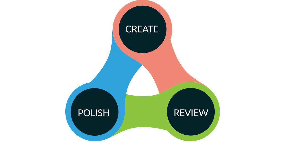
Rapid Prototyping essentially consists of 3 main steps:
1. PROTOTYPE/CREATE
Draft and develop the client’s description/wants into a mockup, keeping in mind the UX and best practices.
2. REVIEW
Present your design and prototype to the client and assess if their wants and requests are fulfilled.
3. POLISH
With the feedback in mind, recognize areas that need to be tweaked and refined.
DEFINING THE SCOPE
Rapid Prototypes are not created with the intention to progress into fully functional solutions, they are simply meant to help visualize and craft the user experience of the finished solution. Hence the importance of the next topic, scoping a prototype. Asking yourself a few simple questions can go a long way in solidifying a strong rapid prototype.

WHAT?
Decide what actually needs to be prototyped. Choosing large components within the project such as intricate interactions, large scale design features, workflow implementation, are all strong candidates for items that should prototyped out to the client.
HOW MUCH?
Showing off the functionality of key features should be limited to those that play significant roles in the design spectrum. Highlighting small interactions or subtle animations are not useful in Rapid Prototyping since they are time consuming to conjure and will delay the presentation for something with little impact on the overall user experience.
NUMBER OF PARTS?
Typically, the full prototype will have many pieces that form a solid whole at the end. A smart approach would be to start out with a broad view of the project and plant firm roots. The smaller, more detailed items can come later on once the foundation has been established. It’s ok to not know the exact number of working parts that will make up your project, but you should keep in mind, having an outline of sorts that highlights your large bullet points is extremely helpful.
THE PROTOTYPE HEIRARCHY
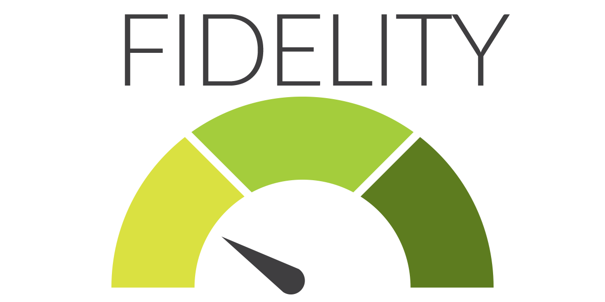
LOW FIDELITY
The most primitive form of prototyping is merely sketching your ideas with paper and pencil. This is typically an early, Version 1.0, if you will that will evolve into a more formal, detailed design later on. This level is perfect for the raw brainstorming sessions that designers typically have and can alleviate the process of converting ideas to fruition.
MID FIDELITY
In this stage, wire framing and task flows form more comprehensive composites of the end product. A primitive black and white creative can show the intent of an application or website without distraction. These type of renderings are ideal for capturing the needs of the client and give them a fairly clear picture of what you will be generating.
HIGH FIDELITY
These types of rapid prototypes are the most realistic and are a static version of the finished solution. Of course, these are the most labor intensive and without proper planning and a high-level of skill can bog down the “rapid” phase of the prototyping. Even though the majority of these high-fidelity depictions cannot be directly converted to code, they can show the client your clear direction and often instill a higher level of trust with the client.

SELECTING THE RIGHT LEVEL
A critical aspect of a project is reading the client and their wishes and in turn selecting the appropriate fidelity grade. It is never a bad idea to begin in the low category as this takes minimal time and can translate your thoughts to a physical being. However, depending on the complexity of the development, you need to identify which stage will convey your design and tailor to the prospective user’s guidelines. Many clients will place a high amount of stock in the look and feel of a product rather than the functional reliability. Knowing your audience is paramount in choosing which fidelity level makes the most sense.
Summary
Prototyping is an unavoidable aspect of interface design and development. It comprises the idea of manifesting ideas and cognitive solutions into a tangible artifact. The idea of Rapid Prototyping takes that one step further and enforces the notion of being both fast and efficient when mocking up a new application or website design. Use any tool that can improve your productivity and effectiveness, just make sure you set yourself up for victory by creating reusable elements for when you inevitably have a large project with a tight deadline.