Bootstrap 4 vs. Bootstrap 3

When it comes to building a website, especially a fully responsive one, there are many tools out there to help with creating a gorgeous, mobile-friendly design.
Bootstrap is the most popular HTML, CSS, and JS framework for developing responsive, mobile first projects on the web. This post will highlight the key differences, additions, and subtractions from version 3 to the soon-to-be released version 4.
Perhaps before we compare versions, a brief synopsis of the Bootstrap platform is in order to really capture the essence of how it works and helps out front-end developers.
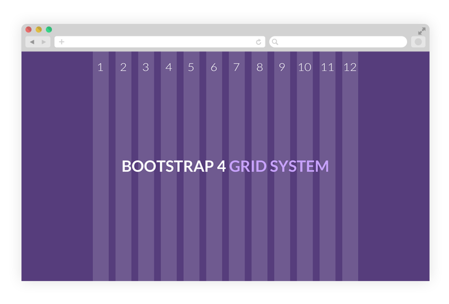
Bootstrap is completely free for download and includes fantastic documentation on building your new site using their framework, including installing, compiling and using built in components. “Bootstrap easily and efficiently scales your websites and applications with a single code base, from phones to tablets to desktops with CSS media queries.” Essentially this takes place thanks to a 12-column grid system that is styled to scale with different device screen sizes using CSS Media Queries. The website also gives you templates so you can quickly build a custom web page in minutes.
After reading up on the basics of Bootstrap (or if you already know it all!), we can begin to talk about the cool new features version 4 will bring to the table. As technology rapidly evolves, newer and smarter languages are developed to make building clean, fast websites much simpler. Such is the case with the newest release of Bootstrap. The team states that this “version 4 is major rewrite of almost the entire project”. We will summarize some key highlights of this overhaul.

Browser support
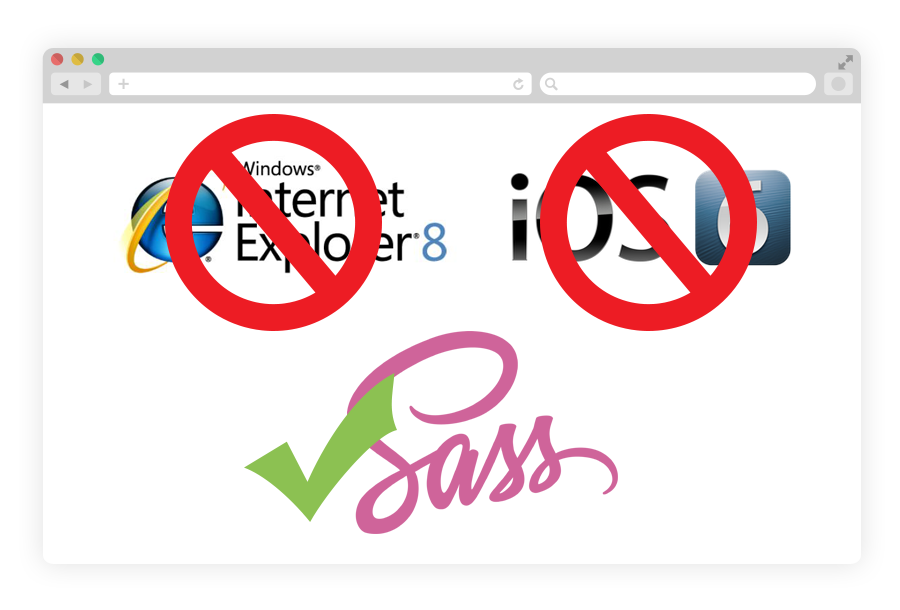
- Dropped IE8 and iOS 6 support. v4 is now only IE9+ and iOS 7+. For sites needing either of those, use v3.
Global changes
- Switched from Less to Sass for source CSS files.
- Global font-size increased from 14px to 16px.
- Added a new grid tier for ~480px and below.
Grid system

- Added support for flexbox (set $enable-flex: true and recompile) in the grid mixins and predefined classes.
- As part of flexbox, included support for vertical and horizontal alignment classes.
- Added a new sm grid tier below 768px for more granular control. There is now xs, sm, md, lg, and xl. This also means every tier has been bumped up one level (so .col-md-6 in v3 is now .col-lg-6 in v4).
- Changed grid system media query breakpoints and container widths to account for new grid tier and ensure columns are evenly divisible by 12 at their max width.
- Grid breakpoints and container widths are now handled via Sass maps ($grid-breakpoints and $container-max-widths) instead of a handful of separate variables. These replace the @screen-* variables entirely and allow you to fully customize the grid tiers.
- Media queries have also changed. Instead of repeating media query declarations with the same value each time, there is now @include media-breakpoint-up/down/only. Now, instead of writing @media (min-width: @screen-sm-min) { … }, you can write @include media-breakpoint-up(sm) { … }.
Components
- Dropped the Glyphicons icon font.
- Dropped the Affix jQuery plugin. They recommend using a position: sticky polyfill instead.
Images
- Renamed .img-responsive to .img-fluid.
Buttons
- Renamed .btn-default to .btn-secondary.
- Dropped the .btn-xs class entirely as .btn-sm is proportionally much smaller than v3’s.
Navs
- Dropped nearly all > selectors for simpler styling via un-nested classes.
- Instead of HTML-specific selectors like .nav > li > a, there are separate classes for .navs, .nav-items, and .nav-links. This makes your HTML more flexible while bringing along increased extensibility.
Panels (Now Cards)

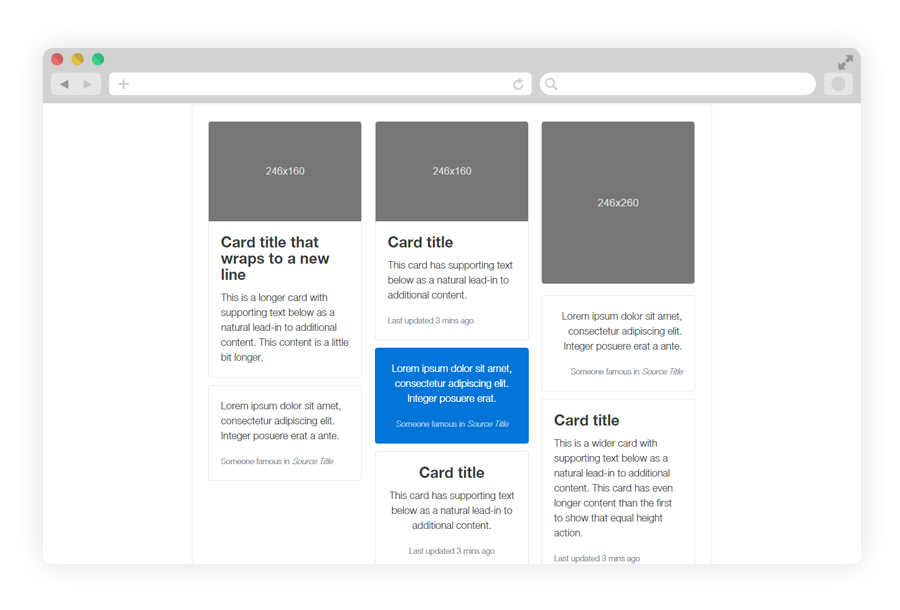
- .panel to .card
- .panel-default removed and no replacement
- .panel-heading to .card-header
- .panel-title to .card-header. Depending on the desired look, you may also want to use heading elements or classes (e.g. h3, .h3) or bold elements or classes (e.g. strong, b , .font-weight-bold). Note that .card-title, while similarly named, produces a different look than .panel-title.
- .panel-body to .card-block
- .panel-footer to .card-footer
Responsive utilities
- All @screen- variables have been removed in v4.0.0. Use the media-breakpoint-up(), media-breakpoint-down(), or media-breakpoint-only() Sass mixins or the $grid-breakpoints Sass map instead.
The responsive utility classes have also been overhauled. - The .hidden and .show classes have been removed because they conflicted with jQuery’s $(…).hide() and $(…).show() methods. Instead, try toggling the [hidden] attribute, use inline styles like style=”display: none;” and style=”display: block;”, or toggle the .invisible class.
- The old classes (.hidden-xs .hidden-sm .hidden-md .hidden-lg .visible-xs-block .visible-xs-inline .visible-xs-inline-block .visible-sm-block .visible-sm-inline .visible-sm-inline-block .visible-md-block .visible-md-inline .visible-md-inline-block .visible-lg-block .visible-lg-inline .visible-lg-inline-block) are gone.
- They have been replaced by .hidden-xs-up .hidden-xs-down .hidden-sm-up .hidden-sm-down .hidden-md-up .hidden-md-down .hidden-lg-up .hidden-lg-down.
- The .hidden-*-up classes hide the element when the viewport is at the given breakpoint or larger (e.g. .hidden-md-up hides an element on medium, large, and extra-large devices).
- The .hidden-*-down classes hide the element when the viewport is at the given breakpoint or smaller (e.g. .hidden-md-down hides an element on extra-small, small, and medium devices).
- Rather than using explicit .visible-* classes, you make an element visible by simply not hiding it at that screen size. You can combine one .hidden-*-up class with one .hidden-*-down class to show an element only on a given interval of screen sizes (e.g. .hidden-sm-down.hidden-xl-up shows the element only on medium and large devices).
- Note that the changes to the grid breakpoints in v4 means that you’ll need to go one breakpoint larger to achieve the same results (e.g. .hidden-md is more similar to .hidden-lg-down than to .hidden-md-down). The new responsive utility classes don’t attempt to accommodate less common cases where an element’s visibility can’t be expressed as a single contiguous range of viewport sizes; you will instead need to use custom CSS in such cases.
To view even more notable changes, visit v4-alpha migration.
As you can see there has been a lot of attention paid in optimizing and cleaning up unnecessary elements and classes throughout the entire framework. Bootstrap v4 promises to be much quicker and streamlined for even greater flexibility and ease when creating an awesome mobile-friendly website.